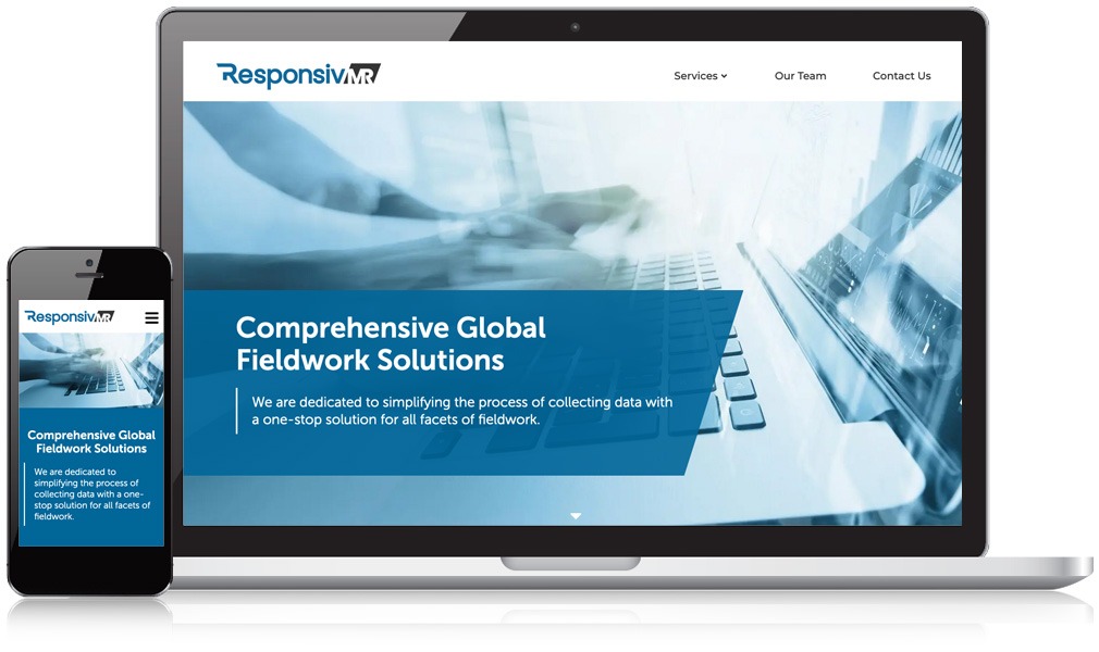
ResponsivMR Gets a Sleek Site Redesign & Rebrand
ResponsivMR simplifies the process of collecting data with a one stop solution for all facets of fieldwork. Previously known as Partners & Shorr, they were concerned that their brand sounded too much like a law firm, and came to Mannix for a rebrand which included logo, color set and site design. They wanted this design to show speed and responsiveness, using colors and fonts that are tech-focused and precise.
By creating a modern website that was mobile-friendly and easy to navigate, the ResponsivMR site immediately generated more new visitors and page views. Mannix strategically crafted a brand tool kit to clearly distinguish ResponsivMR’s identity, which plays on the concept of them being responsive, doing research where the people interviewed are responsive MR stands for market research.
Partner with Us Today and See Your Business Thrive Online
Ready to get started or want to learn more about how we work with clients? Let’s get it scheduled.
