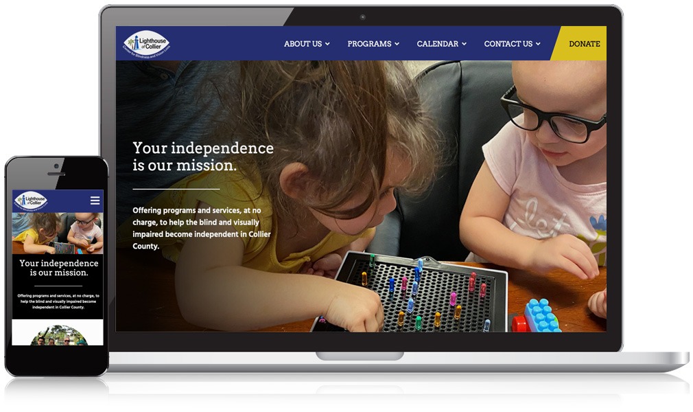
ADA Focused Web Redesign for Non-Profit Leads to 34% Increase in Traffic
Lighthouse of Collier is a 501c3 Florida non-profit that seeks to provide programs to foster independence and enhance the quality of life for blind, visually impaired people & their caregivers. LOC needed a website redesign that would improve their look, usability, and accessibility for visitors to the site. As the website serves the visually impaired and blind, the site not only needed to meet reasonable standards of the WCAG 2.1 AA code, which is the standard at this time for accessibility, but also would take a thoughtful approach to design for the user experience.
The Results
- 34%More Traffic
- 43%More Page Views
- 25%Increase in Average Session Duration
With multiple opportunities to improve the site, our Mannix team got to work. By developing a new user experience for the calendar of events, we were able to improve clarity and make it easy for users to find and navigate.
Our custom design prominently features multiple color contrast options as well as the ability to increase/decrease the size of the text to best suit the needs of the individual user.
In addition, we created a landing page for donations that would clearly communicate the variety of donor options available. Our SEO friendly website design improved organic search traffic by 9.81% and helped garner a whopping 162% increase in page views for the adult programs that LOC offers.
Our goals in redesigning our website were to improve accessibility and navigation so that all of our website visitors would have a better experience. The team at Mannix Marketing exceeded our goals. We had a 3rd party organization test our newly re-designed website and they gave it a thumbs up in terms of accessibility. In addition, many of our clients who are visually impaired have provided feedback to us that they now feel comfortable accessing our website.
| Lighthouse of Collier
Partner with Us Today and See Your Business Thrive Online
Ready to get started or want to learn more about how we work with clients? Let’s get it scheduled.


