Naturally, when doing a redesign, you want the result to be the best hotel website. One that entices lookers to become bookers, to choose your lodging over all the other available lodging options. You know the site has to be mobile friendly and easy-to-navigate, with beautiful photography to showcase everything your hotel has to offer… but what else do you need?
Hotel Website Elements that Convert Lookers to Bookers
While it makes sense to keep your website modern, the best hotel websites help potential guests solve problems and make it easy for visitors to complete the travel planning process. Here are 15 features we recommend. Keep in mind – this is just the tip of the iceberg. A well optimized SEO friendly hotel website that ranks well is critical, and that just happens to be our specialty (check out some of our latest designs here).
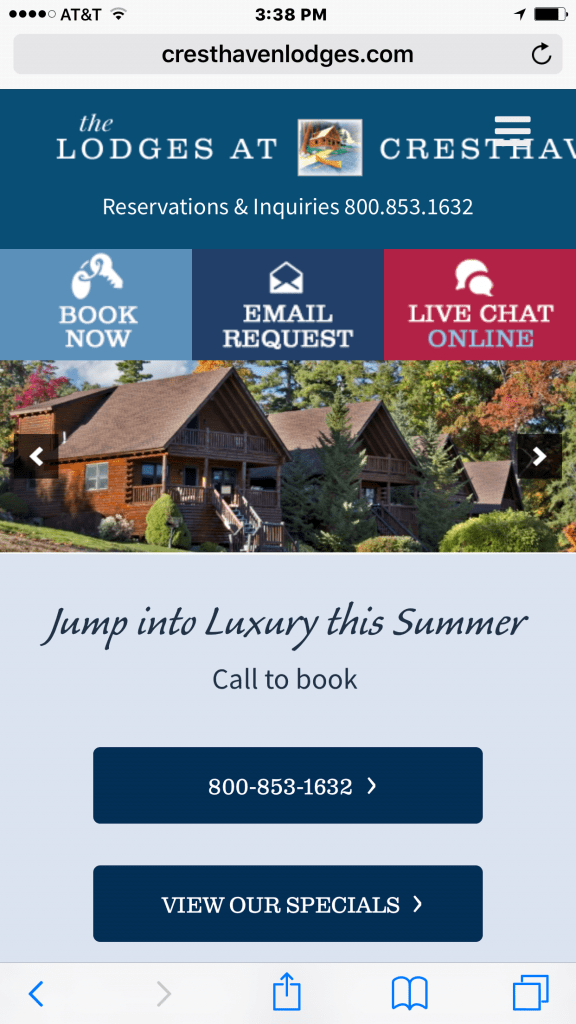 1. Book Now Button or Embedded Reservations
Online reservations are a must. On mobile we recommend a simple book now button. For desktop searches, when possible it is best to embed a date selection wizard into every page that connects to your online reservation system.
2. Smarter Live Chat and Chat Bots
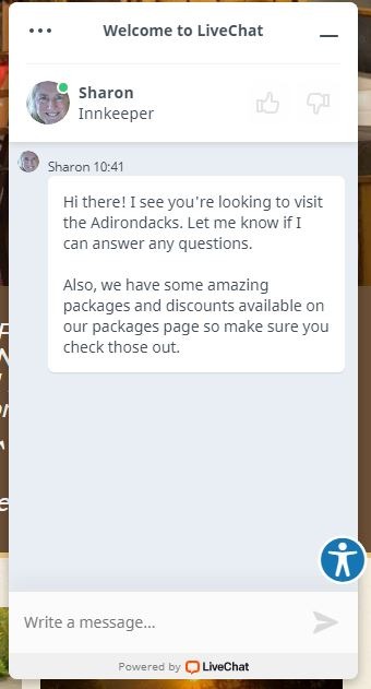
A huge number of people are secretly planning their vacations at work, so they can’t really pick up the phone in their cubicle and ask a simple question. Make it easy for them by adding live chat. The cheapest no frills solution is www.providesupport.com. The best solution for the price is www.livechat.com as it offers more custom administrative functions.
When adding a live chat feature to your site, be creative! Don’t just pop up with a generic ‘Hi, can I help you’ greeting. Instead, why not create a live chat that offers a benefit for booking direct? The Fern Lodge is a great example of creating a custom live chat experience.
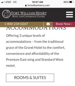
3. Sticky Mobile Click to Call
When you view the site on mobile, the phone number or a phone icon that you can click on to call should be on every page and stick to the top of the screen regardless of how far down the page you scroll. Bonus points if you have a phone number and a book now button in your sticky header!
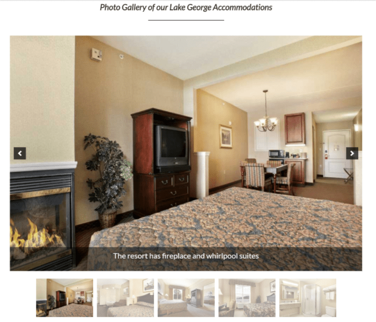
4. Photos and Videos Dedicated Page
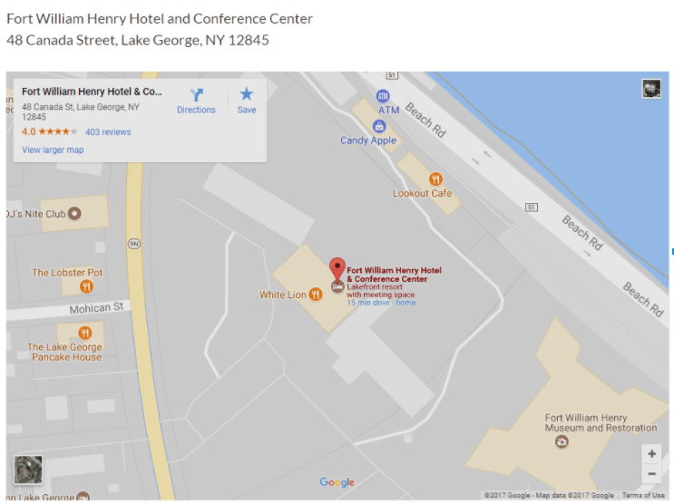
Sure, you have photos and videos throughout the whole site, but travelers want to see them all in one place and be able to self-direct what photos they look at. Each photo should have a description that describes the photo and features the unique selling points of the resort. Consider having multiple photo album pages that focus on different interests, rooms, activities, weddings, meetings, amenities, etc. Check out the example from the Fort William Henry Resort in Lake George.
5. The Google Driving Directions Widget
This may sound obvious but does your hotel website just have a Google Map or does it have the driving directions map? Most hotel sites have a map, but the map widget doesn’t have the directions easily seen in the screenshot. This small change can be hugely helpful when it comes to helping potential customers find your accommodations quickly and is an added convenience factor that could help you seal the deal.
6. Humans to Answer the Phone
If you can’t answer the phone, hire a service to answer the calls that you can’t for a small percentage fee. Not sure who to use? Give us a call and we can point you in the right direction.
Also, we recommend that you consider training your new staff with call tracking. listen to every call and coach them on how to improve their customer service skills so they’re well prepared when your customers pick up the phone.
7. Don’t Forget The Amenities Page
So many hoteliers get caught up in weddings, their restaurant, their rooms and photo pages, they forget the amenities and resort overview page that sells the property as a whole.
Don’t depend on the main home page to showcase everything your hotel offers. Instead, create a special page to highlight what truly sets your accommodations apart and help customers to realize they should book with you! Hilton Barbados Resort does a great job of showcasing their amenities.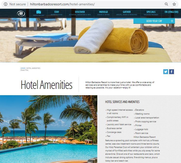
8. Specials and Hotel Deals
Everyone is looking for a deal. Even if you don’t offer deals or discounts, consider putting together packages or at least explain that your rates are competitive and most affordable when booked directly through your website – if that’s the case!
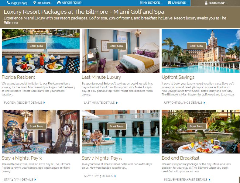
Take your specials a step farther by partnering with other local establishments to create unique packages that make exploring the area affordable and convenient. The Biltmore Hotel does a great job enticing lookers with a variety of specials and packages. These are a great way to set yourself apart from the competition and could turn a looker into a booker!
9. Itineraries, Events or Activities by Season
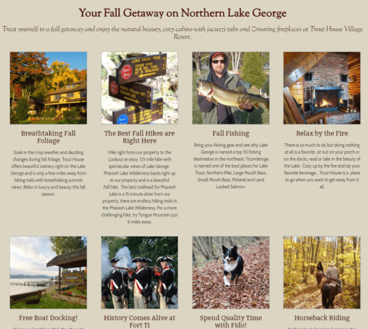
Are you off the beaten path? Are there special activities by season that you can highlight? Are your guests looking for scenic beauty, adventure or romance? Think about each of your customer types: families, millennials, young couples, girls getaways and show them all that your resort and region have to offer just for them.
The Trout House is a perfect example of this. They are family run and bucking the trend to sell inventory on the OTA’s. They sell themselves well by sharing unique experiences by season.
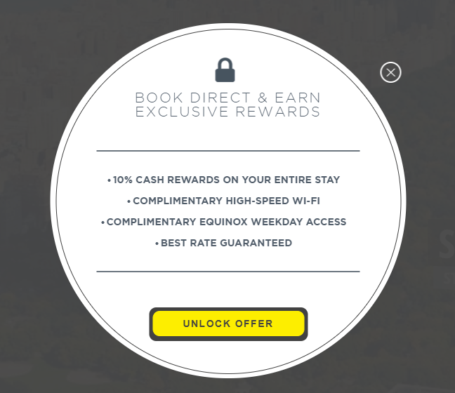
10. Give them GREAT reasons to book direct
Whether it’s free upgrades, a glass of wine upon arrival or an extra room night when they book four, find a way to entice your customer to book directly with you, we like this example below from Gotham Hotel in NYC. They are using The Guest Book to run this program.
11. Social Proof: Testimonials and Guest Reviews
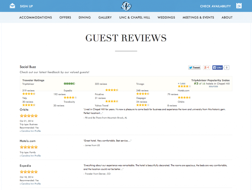
We all know how powerful TripAdvisor is, but they are selling bookings through OTA’s and diminishing your margins. Why not add testimonials and reviews to your own hotel website like in the example below from the Carolina Inn.
There’s a feeling of assurance that comes from hearing what actual customers have to say about their experience with a business – be it a hotel, resort, or any other type of company.
In fact, this hotel’s TripAdvisor rating has them at 3rd place out of 16 hotels in the region. By showcasing this it indicates that they’re comfortable with their ranking (whereas many businesses might only display their TripAdvisor rating if they were #1 in their category).
12. Local Insights Blog
As consumers, we don’t always buy the highest quality product or the lowest cost option. Often times we forgo the most logical option by choosing to buy local or buy from a company that delivers the best service and support. Why? Because these businesses understand that the product is merely part of a larger experience.
In the world of lodging and hospitality, travelers aren’t simply looking for a place to rest their head at night. They’re looking for things to do in the region, places to eat, and an overall experience.
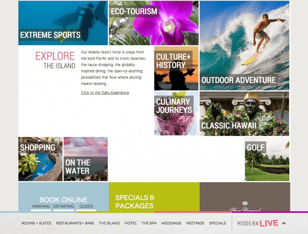
Often times, hotels have a deep connection to the region when it comes to hot spots for tourists, best restaurants in the region, and recommendations on area attractions that are likely to be sought out by their guests. However, for the majority of hotels, their website hardly reflects their knowledge of the area.
The Modern Honolulu stands apart from the pack as they use valuable real estate on their website’s home page to highlight something other than just their accommodations, venue, or specials. Specifically, they’re leveraging their deep knowledge of Honolulu’s tourist attractions to appeal to travelers’ other needs.
13. Easily Accessible, ADA Compliant, Responsive Design
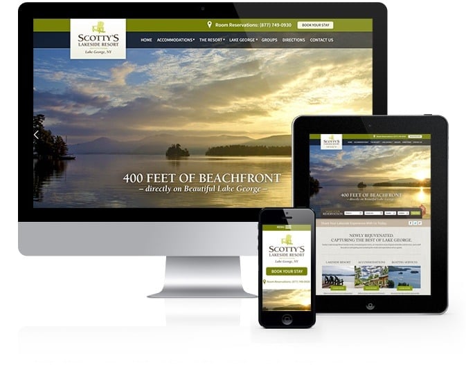
Whether they’re on a desktop, tablet or smartphone, today’s travelers are hopping from one screen to the next to find hotels online. This is why it’s imperative for hotels to have a website that’s designed to work across devices and provide a great experience for desktop, tablet, and smartphone visitors, as shown in the example below for the new responsive designed website for Scotty’s Lakeside Resort.
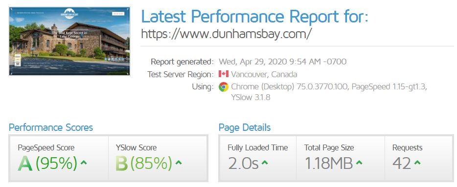
14. Fast Loading Design
A pretty design means nothing if it is slow to load. Think about the last slow site that you encountered. Did you stay long enough to get what you came to the site for? Probably not. If your website takes longer than 3 seconds to load, you will lose over a quarter of your users. That means you are losing 1/4 of bookers to your competitors solely due to your load speed.
15. Schema Markup
Schema (or structured data) is code added to a website to help search engines understand certain pieces of data on your website. Hotel schema allows search engines to better understand things like checking and checkout time, the number of rooms you have available, if rooms are pet friendly, etc…By implementing review schema, your website may start to show star ratings in the SERPs, like the example below.

According to Brewer Digital Marketing, hotel websites experience a 40-60% lift in click-through rate from the search engine results when the star rating is displayed.
Considering a New Website for Your Hotel?
If you’re considering a new website for your hotel and want to convert more lookers to bookers, then it’s time to request your free marketing review with the team that specializes in website design and digital marketing for hotels!
There is a lot to creating a hotel website that converts – and we’ve spent decades honing our craft! Let’s chat for 15 minutes. We promise that you’ll learn a lot and most likely you’ll find out that you want to do business with us.
Call (518) 743-9424 and ask for a 15-minute digital marketing review or contact us online and we’ll show you what we can do to increase your bookings, increase your ADR, and increase your occupancy rates!
Content Credit: This great post was originally written by Mannix Alumni Jeremy Abel and has been rewritten to include more features by Sara Mannix. It was originally published in 2014 and has been updated as of 2020.


